NavigationView
A WinUI-inspired navigation control with a left navigation pane and a right content area, encapsulating item selection, content switching, and header management into a single reusable control.
Overview
NavigationView provides the common "sidebar navigation + content area" pattern found in modern desktop applications. It eliminates the manual wiring typically needed for this layout — click handlers, selection state, header updates, and content switching are all handled internally.
The control composes a HorizontalGridControl internally with two columns: a fixed-width nav pane and a flexible content area. The content area includes an optional header (title + subtitle) and a ScrollablePanelControl for the active section's content.
Key feature: NavigationView is gradient-transparent — when placed in a window with a gradient background, the gradient shows through the nav pane and header areas while the content panel can have its own opaque background.
Responsive Display Modes
NavigationView adapts its navigation pane based on available width, inspired by WinUI's responsive patterns:
| Mode | Nav Pane | Content Header | Trigger (Auto) |
|---|---|---|---|
| Expanded | Full: icons + text | Normal title + subtitle | width >= ExpandedThreshold (default 80) |
| Compact | Icons only, 5 chars wide | Normal title + subtitle | CompactThreshold <= width < ExpandedThreshold (default 50-80) |
| Minimal | Hidden (0 width) | ≡ hamburger left of title |
width < CompactThreshold (default <50) |
- Compact mode: The nav column shrinks to icon-only. A
≡hamburger button at the top opens the full nav as a portal overlay. Clicking an icon directly selects that nav item. - Minimal mode: The nav column is completely hidden. The
≡character in the content header opens a portal overlay with the full nav list. Clicking outside the portal dismisses it. - Auto mode (default): The display mode is resolved automatically based on the control's actual rendered width and the configured thresholds.
- Transitions between modes can be animated (smooth width interpolation) or instant.
Hierarchical Items
NavigationView supports headers, sub-items, and separators in addition to flat items. Headers group related items and support collapse/expand.
┌──────────────────────┐
│  ⚙  Settings         │
│                      │
│  [-] Layout & Windows │  ← Header (expanded)
│      ▸ IDE Layout    │  ← Sub-item (selected)
│        File Explorer │  ← Sub-item
│  [+] Controls        │  ← Header (collapsed)
│    About             │  ← Flat item
└──────────────────────┘
NavigationItemType
| Type | Selectable | Description |
|---|---|---|
Item |
Yes | Regular selectable navigation item (default) |
Header |
No | Non-selectable group header with collapse/expand |
Separator |
No | Visual divider line |
Properties
Navigation Pane
| Property | Type | Default | Description |
|---|---|---|---|
NavPaneWidth |
int |
26 |
Width of the left navigation column (minimum 10) |
PaneHeader |
string? |
null |
Markup text shown as the nav pane header |
SelectedItemBackground |
Color |
rgb(40,50,80) |
Background color for the selected nav item |
SelectedItemForeground |
Color |
White |
Foreground color for the selected nav item |
ItemForeground |
Color |
Grey |
Default foreground color for unselected items |
SelectionIndicator |
char |
'▸' |
Character used as the selection indicator prefix |
Responsive Display
| Property | Type | Default | Description |
|---|---|---|---|
PaneDisplayMode |
NavigationViewDisplayMode |
Auto |
Display mode: Auto, Expanded, Compact, or Minimal |
ExpandedThreshold |
int |
80 |
Width at or above which Auto resolves to Expanded |
CompactThreshold |
int |
50 |
Width at or above which Auto resolves to Compact (below = Minimal) |
CompactPaneWidth |
int |
5 |
Width of the nav pane in Compact mode |
AnimateTransitions |
bool |
true |
Whether mode transitions animate the nav pane width |
CurrentDisplayMode |
NavigationViewDisplayMode |
- | The resolved display mode (read-only, never Auto) |
IsPortalOpen |
bool |
- | Whether the navigation portal overlay is currently open (read-only) |
Content Area
| Property | Type | Default | Description |
|---|---|---|---|
ContentBorderStyle |
BorderStyle |
Rounded |
Border style for the content panel |
ContentBorderColor |
Color? |
null |
Border color for the content panel |
ContentBackgroundColor |
Color? |
null |
Background color for the content panel |
ContentPadding |
Padding |
(1,0,1,0) |
Padding inside the content panel |
ShowContentHeader |
bool |
true |
Whether to show the title + subtitle header |
Selection
| Property | Type | Default | Description |
|---|---|---|---|
SelectedIndex |
int |
-1 |
Index of the currently selected item |
SelectedItem |
NavigationItem? |
null |
The currently selected item (read-only) |
Items |
IReadOnlyList<NavigationItem> |
empty | Read-only collection of all items |
Standard
| Property | Type | Default | Description |
|---|---|---|---|
BackgroundColor |
Color |
inherited | Background color (cascades from parent) |
ForegroundColor |
Color |
White |
Foreground color |
ContentPanel |
ScrollablePanelControl |
- | Direct access to the content panel (read-only) |
Events
| Event | Arguments | Description |
|---|---|---|
SelectedItemChanging |
NavigationItemChangingEventArgs |
Raised before selection changes (cancelable) |
SelectedItemChanged |
NavigationItemChangedEventArgs |
Raised after selection has changed |
ItemInvoked |
NavigationItemChangedEventArgs |
Raised when Enter/Space is pressed on the selected item |
DisplayModeChanged |
NavigationViewDisplayMode |
Raised when the resolved display mode changes |
GotFocus |
EventArgs |
Raised when the control receives focus |
LostFocus |
EventArgs |
Raised when the control loses focus |
Event Args
NavigationItemChangedEventArgs:
OldIndex/NewIndex— indices of the old and new selectionOldItem/NewItem— the NavigationItem instances
NavigationItemChangingEventArgs:
- Same as above, plus
Cancel— set totrueto prevent the selection change
Methods
Item Management
| Method | Description |
|---|---|
AddItem(NavigationItem item) |
Add a navigation item |
AddItem(string text, string? icon, string? subtitle) |
Add an item with properties, returns the created NavigationItem |
AddHeader(string text, Color? color) |
Add a header item, returns the created NavigationItem |
AddItemToHeader(NavigationItem header, string text, string? icon, string? subtitle) |
Add a child item under a header |
InsertItem(int index, NavigationItem item) |
Insert an item at a specific position |
RemoveItem(int index) |
Remove item by index (cascades children if header) |
RemoveItem(NavigationItem item) |
Remove a specific item |
ClearItems() |
Remove all items |
ToggleHeaderExpanded(NavigationItem header) |
Toggle collapse/expand for a header |
Content Management
| Method | Description |
|---|---|
SetItemContent(NavigationItem item, Action<ScrollablePanelControl> populate) |
Register a content factory for an item |
SetItemContent(int index, Action<ScrollablePanelControl> populate) |
Register a content factory by index |
NavigationItem
public class NavigationItem
{
    public string Text { get; set; }
    public string? Icon { get; set; }             // emoji/symbol prefix
    public string? Subtitle { get; set; }         // shown in content header
    public object? Tag { get; set; }
    public bool IsEnabled { get; set; } = true;
    public NavigationItemType ItemType { get; }   // Item, Header, or Separator
    public NavigationItem? ParentHeader { get; }  // parent header for sub-items
    public bool IsExpanded { get; set; } = true;  // for headers only
    public Color? HeaderColor { get; set; }       // for headers only

    // Factory methods
    static NavigationItem CreateHeader(string text, Color? color = null);
    static NavigationItem CreateSeparator();

    // Implicit conversion from string
    NavigationItem item = "Home";
}
Creating NavigationView
Using Builder with Headers (Recommended)
var nav = Controls.NavigationView()
    .WithNavWidth(30)
    .WithPaneHeader("[bold white]  ⚙  Settings[/]")
    .WithContentBorder(BorderStyle.Rounded)
    .WithContentBorderColor(Color.Grey37)
    .WithContentBackground(new Color(30, 30, 40))
    .AddHeader("Layout & Windows", Color.Cyan1, header => header
        .AddItem("IDE Layout", subtitle: "Window layout demo", content: panel =>
        {
            panel.AddControl(Controls.Markup()
                .AddLine("[bold cyan]IDE-style layout[/]")
                .Build());
        })
        .AddItem("File Explorer", subtitle: "Tree control demo", content: panel =>
        {
            panel.AddControl(Controls.Markup()
                .AddLine("[bold]File browser[/]")
                .Build());
        }))
    .AddHeader("Controls", header => header
        .WithColor(Color.Green)
        .AddItem("Interactive Demo", content: panel =>
        {
            panel.AddControl(Controls.Checkbox("Enable feature").Build());
        }))
    .AddItem("About", subtitle: "Application information", content: panel =>
    {
        panel.AddControl(Controls.Markup()
            .AddLine("[bold]MyApp[/] v1.0")
            .Build());
    })
    .WithAlignment(HorizontalAlignment.Stretch)
    .Fill()
    .Build();

window.AddControl(nav);
Using Builder with Flat Items
var nav = Controls.NavigationView()
.WithNavWidth(26)
.WithPaneHeader("[bold white] ⚙ Settings[/]")
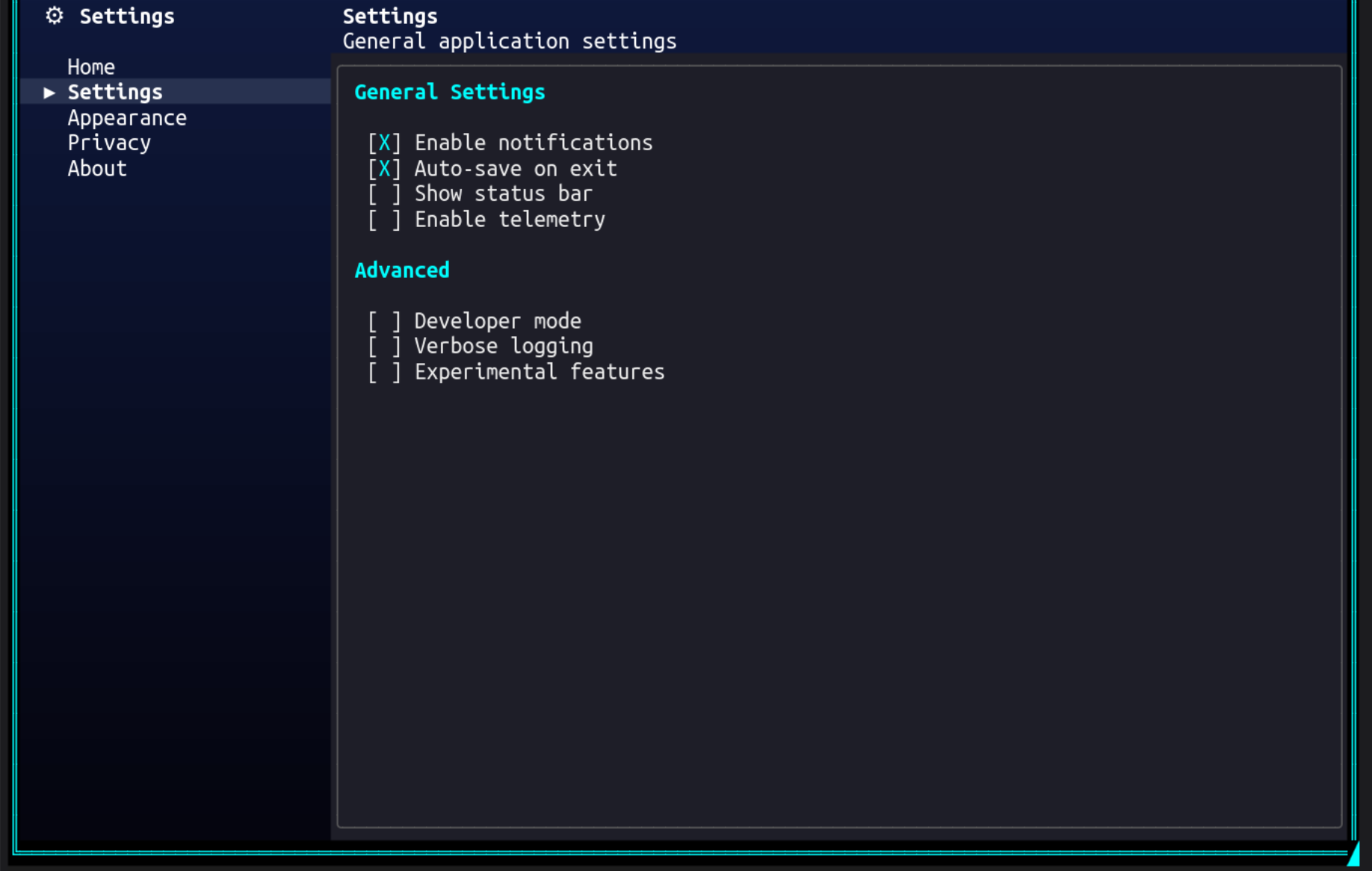
.AddItem("Home", subtitle: "Configure your preferences", content: panel =>
{
panel.AddControl(Controls.Markup()
.AddLine("[bold cyan]Welcome[/]")
.AddLine("This is the home section.")
.Build());
})
.AddItem("Settings", subtitle: "General application settings", content: panel =>
{
panel.AddControl(Controls.Checkbox("Enable notifications")
.Checked(true).Build());
panel.AddControl(Controls.Checkbox("Auto-save on exit")
.Checked(true).Build());
})
.AddItem("About", subtitle: "Application information", content: panel =>
{
panel.AddControl(Controls.Markup()
.AddLine("[bold]MyApp[/] v1.0")
.AddLine("[dim]License: MIT[/]")
.Build());
})
.WithAlignment(HorizontalAlignment.Stretch)
.WithVerticalAlignment(VerticalAlignment.Fill)
.Build();
window.AddControl(nav);
Using Constructor with Hierarchy
var nav = new NavigationView();
nav.NavPaneWidth = 30;
nav.PaneHeader = "[bold white]  Menu[/]";

// Add a header with children
var layoutHeader = nav.AddHeader("Layout", Color.Cyan1);
var ideItem = nav.AddItemToHeader(layoutHeader, "IDE Layout", subtitle: "Layout demo");
nav.SetItemContent(ideItem, panel =>
{
    panel.AddControl(Controls.Label("IDE layout content"));
});

var fileItem = nav.AddItemToHeader(layoutHeader, "File Explorer", subtitle: "File browser");
nav.SetItemContent(fileItem, panel =>
{
    panel.AddControl(Controls.Label("File explorer content"));
});

// Flat items still work
var aboutItem = nav.AddItem("About", subtitle: "App info");
nav.SetItemContent(aboutItem, panel =>
{
    panel.AddControl(Controls.Label("About this app"));
});

window.AddControl(nav);
Keyboard & Mouse Support
| Input | Action |
|---|---|
| Up / Down | Move selection between nav items (skips headers, separators, collapsed children) |
| Home / End | Jump to first / last enabled visible nav item |
| Enter / Space | Invoke the selected item; on a header, toggles expand/collapse |
| Right | On a collapsed header, expand it; otherwise move focus to content panel |
| Left | On a sub-item, collapse its parent header; in content panel, return to nav pane |
| Tab | Move focus from nav pane to content panel |
| Shift+Tab | Move focus from content panel back to nav pane |
| Mouse Click | Click a nav item to select it; click a header to toggle expand/collapse |
| Mouse Wheel | Scroll within the content panel |
| ≡ Click (Compact) | Click the hamburger at the top of the compact nav column to open the full nav as a portal overlay |
| ≡ Click (Minimal) | Click the hamburger character in the content header to open the nav portal overlay |
| Click outside portal | Dismisses the navigation portal overlay |
NavigationView uses a two-zone focus model: the nav pane and the content panel are separate focus zones. When the control first receives focus, the nav pane is active — use arrow keys to browse items, then Right or Tab to move into the content panel. Left or Shift+Tab returns focus to the nav pane.
Architecture
NavigationView internally composes:
HorizontalGridControl— the two-column layoutColumnContainer(left) — nav pane header + item markup controlsColumnContainer(right) — content header + scrollable panelMarkupControlper nav item — with click handlers for selectionScrollablePanelControl— bordered content area
The control implements IContainer and propagates HasGradientBackground from its parent, allowing gradient backgrounds to show through transparent areas.
Content Factory Pattern
Unlike TabControl (which keeps all tab content in the DOM), NavigationView uses content factories — delegates that populate the content panel on demand. Factories are optional — you can use event-driven content instead (see below).
nav.SetItemContent(item, panel =>
{
    // Called each time this item is selected
    // panel.ClearContents() is called automatically before this
    panel.AddControl(Controls.Label("Fresh content"));
});
This means content is rebuilt each time an item is selected. For content that should preserve state across selections, store state externally and restore it in the factory.
Event-Driven Content
As an alternative to content factories, you can manage content through the SelectedItemChanged event and the ContentPanel property. If no content factory is registered for an item, the control skips automatic content clearing — the event handler manages it instead.
nav.SelectedItemChanged += (s, e) =>
{
    nav.ContentPanel.ClearContents();
    nav.ContentPanel.AddControl(Controls.Markup()
        .AddLine($"[bold cyan]{e.NewItem.Text}[/]")
        .AddLine("Content managed by event handler.")
        .Build());
};
This is useful when content switching involves complex state management or when you want to mix factory-based and event-driven items in the same NavigationView.
Visual Layout
┌────────────────────────┬─────────────────────────────────┐
│  ⚙  Settings           │  IDE Layout                     │
│                        │  Window layout demo              │
│  [-] Layout & Windows  │ ╭─────────────────────────────╮ │
│      ▸ IDE Layout      │ │                             │ │
│        File Explorer   │ │  IDE-style layout content   │ │
│  [-] Controls          │ │                             │ │
│        Interactive     │ │                             │ │
│    About               │ │                             │ │
│                        │ ╰─────────────────────────────╯ │
└────────────────────────┴─────────────────────────────────┘
Examples
Hierarchical Navigation with Gradient Background
var gradient = ColorGradient.FromColors(
    new Color(15, 25, 60),
    new Color(5, 5, 15));

var nav = Controls.NavigationView()
    .WithPaneHeader("[bold white]  ⚙  Settings[/]")
    .WithContentBorder(BorderStyle.Rounded)
    .WithContentBorderColor(Color.Grey37)
    .WithContentBackground(new Color(30, 30, 40))
    .AddHeader("General", Color.Cyan1, header => header
        .AddItem("Notifications", content: panel =>
        {
            panel.AddControl(Controls.Checkbox("Push notifications").Checked(true).Build());
            panel.AddControl(Controls.Checkbox("Email alerts").Build());
        })
        .AddItem("Auto-update", content: panel =>
        {
            panel.AddControl(Controls.Checkbox("Check for updates").Checked(true).Build());
        }))
    .AddHeader("Display", Color.Yellow, header => header
        .AddItem("Theme", content: panel =>
        {
            panel.AddControl(Controls.Markup().AddLine("[bold cyan]Theme[/]").Build());
            panel.AddControl(Controls.Checkbox("Dark mode").Checked(true).Build());
        }))
    .WithAlignment(HorizontalAlignment.Stretch)
    .Fill()
    .Build();

var window = new WindowBuilder(ws)
    .WithTitle("Settings")
    .WithSize(80, 30)
    .Centered()
    .WithBackgroundGradient(gradient, GradientDirection.Vertical)
    .AddControl(nav)
    .BuildAndShow();
Cancelable Navigation
var nav = Controls.NavigationView()
    .AddItem("Editor", content: panel => { /* ... */ })
    .AddItem("Preview", content: panel => { /* ... */ })
    .OnSelectedItemChanging((sender, e) =>
    {
        if (e.OldItem?.Text == "Editor" && HasUnsavedChanges())
        {
            e.Cancel = true;
            ShowSaveDialog();
        }
    })
    .Build();
Dynamic Items
var nav = new NavigationView();
nav.PaneHeader = "[bold]  Projects[/]";

foreach (var project in projects)
{
    var item = nav.AddItem(project.Name, subtitle: project.Description);
    item.Tag = project;
    nav.SetItemContent(item, panel =>
    {
        var p = (Project)item.Tag!;
        panel.AddControl(Controls.Markup()
            .AddLine($"[bold]{p.Name}[/]")
            .AddLine($"[dim]{p.Description}[/]")
            .AddLine($"Status: {p.Status}")
            .Build());
    });
}

window.AddControl(nav);
Programmatic Expand/Collapse
var nav = new NavigationView();
var header = nav.AddHeader("Advanced", Color.Red);
nav.AddItemToHeader(header, "Debug Options");
nav.AddItemToHeader(header, "Diagnostics");

// Start collapsed
nav.ToggleHeaderExpanded(header);  // Collapses the header

// Later, expand programmatically
if (!header.IsExpanded)
    nav.ToggleHeaderExpanded(header);
Builder Reference
NavigationViewBuilder Methods
| Category | Method | Description |
|---|---|---|
| Items | AddItem(text, icon?, subtitle?, content?) |
Add a flat nav item with optional content factory |
AddItem(NavigationItem, content?) |
Add an existing NavigationItem | |
AddHeader(text, configure) |
Add a header with child items | |
AddHeader(text, color, configure) |
Add a colored header with child items | |
WithSelectedIndex(int) |
Set initially selected item (among selectable items) | |
| Nav Pane | WithNavWidth(int) |
Set nav pane width |
WithPaneHeader(string) |
Set pane header markup | |
WithSelectedColors(fg, bg) |
Set selected item colors | |
WithSelectionIndicator(char) |
Set selection indicator character | |
| Responsive | WithPaneDisplayMode(mode) |
Set display mode (Auto, Expanded, Compact, Minimal) |
WithExpandedThreshold(int) |
Set width threshold for Expanded mode | |
WithCompactThreshold(int) |
Set width threshold for Compact mode | |
WithCompactPaneWidth(int) |
Set nav pane width in Compact mode | |
WithAnimateTransitions(bool) |
Enable/disable animated width transitions | |
| Content | WithContentBorder(BorderStyle) |
Set content panel border |
WithContentBorderColor(Color) |
Set content panel border color | |
WithContentBackground(Color) |
Set content panel background | |
WithContentPadding(l, t, r, b) |
Set content panel padding | |
WithContentHeader(bool) |
Show/hide content header | |
| Events | OnSelectedItemChanged(handler) |
Attach changed event handler |
OnSelectedItemChanging(handler) |
Attach changing event handler | |
| Layout | WithAlignment(HorizontalAlignment) |
Set horizontal alignment |
WithVerticalAlignment(VerticalAlignment) |
Set vertical alignment | |
Fill() |
Fill available vertical space | |
WithMargin(l, t, r, b) |
Set margins | |
WithWidth(int) |
Set explicit width | |
WithName(string) |
Set control name | |
WithTag(object) |
Set tag data |
NavigationHeaderBuilder Methods
| Method | Description |
|---|---|
WithColor(Color) |
Set the header color |
AddItem(text, icon?, subtitle?, content?) |
Add a child item under this header |
AddItem(NavigationItem, content?) |
Add an existing NavigationItem as a child |
Responsive NavigationView
var nav = Controls.NavigationView()
    .WithNavWidth(28)
    .WithPaneHeader("[bold white]  ◆  MyApp[/]")
    .WithPaneDisplayMode(NavigationViewDisplayMode.Auto)
    .WithExpandedThreshold(80)
    .WithCompactThreshold(50)
    .WithAnimateTransitions(true)
    .AddItem("Dashboard", icon: "◈", content: panel =>
    {
        panel.AddControl(Controls.Label("Dashboard content"));
    })
    .AddItem("Settings", icon: "⚙", content: panel =>
    {
        panel.AddControl(Controls.Checkbox("Dark mode").Checked(true).Build());
    })
    .WithAlignment(HorizontalAlignment.Stretch)
    .Fill()
    .Build();

// React to mode changes
nav.DisplayModeChanged += (sender, mode) =>
{
    // mode is Expanded, Compact, or Minimal
};
At full width the nav pane shows icons + text. Resize the terminal narrower than 80 columns and the nav pane collapses to icon-only with a hamburger button. Below 50 columns the nav pane hides entirely and a ≡ in the content header opens a portal overlay.
Comparison with TabControl
| Feature | NavigationView | TabControl |
|---|---|---|
| Layout | Side-by-side (left nav + right content) | Stacked (top header + content below) |
| Content model | Content factories (rebuild on select) | Persistent DOM (visibility toggle) |
| State preservation | External (rebuild each time) | Automatic (controls stay in tree) |
| Hierarchy | Headers with collapsible sub-items | Flat tabs only |
| Responsive | Auto/Compact/Minimal modes | No responsive behavior |
| Best for | Settings panels, app navigation | Document tabs, multi-view editors |
| Gradient support | Transparent nav pane | Opaque header |
Best Practices
- Choose a content model: Use content factories for simple cases where content is rebuilt each time; use event-driven content (
SelectedItemChanged+ContentPanel) for complex state management - Use headers for grouping: When you have more than 5-6 items, group them under headers for better organization
- Set explicit size: Use
WithAlignment(Stretch)andFill()for full-area navigation - Keep nav items short: 1-2 words work best in the nav pane
- Use subtitles: They provide context in the content header when an item is selected
- Gradient backgrounds: NavigationView is gradient-transparent by default — pair with
WithBackgroundGradientfor modern looks - External state: Since content is rebuilt on each selection, store stateful data (checkbox values, text input) outside the factory and restore it
- Responsive design: Use
Autodisplay mode (default) for apps that may run at different terminal widths — the nav pane adapts automatically - Custom thresholds: Adjust
ExpandedThresholdandCompactThresholdto match your content's needs — wider nav panes may benefit from a higher expanded threshold
See Also
- TabControl — For tabbed multi-page interfaces
- Fluent Builders — Builder API reference
- Gradients — Background gradient system